

Creative Beginnings Early Learning
and Care
A BRAND EVOLUTION ROOTED IN NATURE
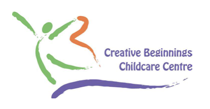
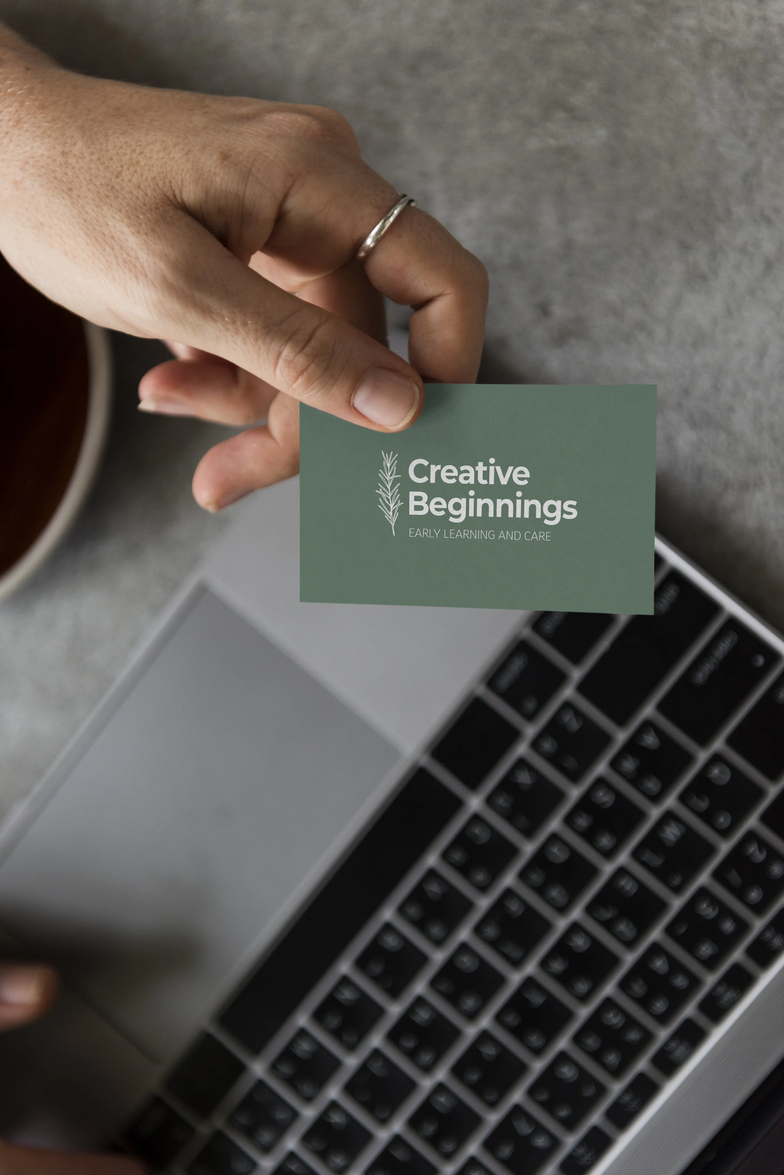
Creative Beginnings, a childcare organization serving rural communities for over 35 years, came to us seeking a refreshed identity that aligned with their philosophy of open-ended learning and connection to nature. Their existing logo, filled with vibrant colours and playful energy, had served them well for decades - but no longer reflected who they were or what they believed in today.
BEFORE
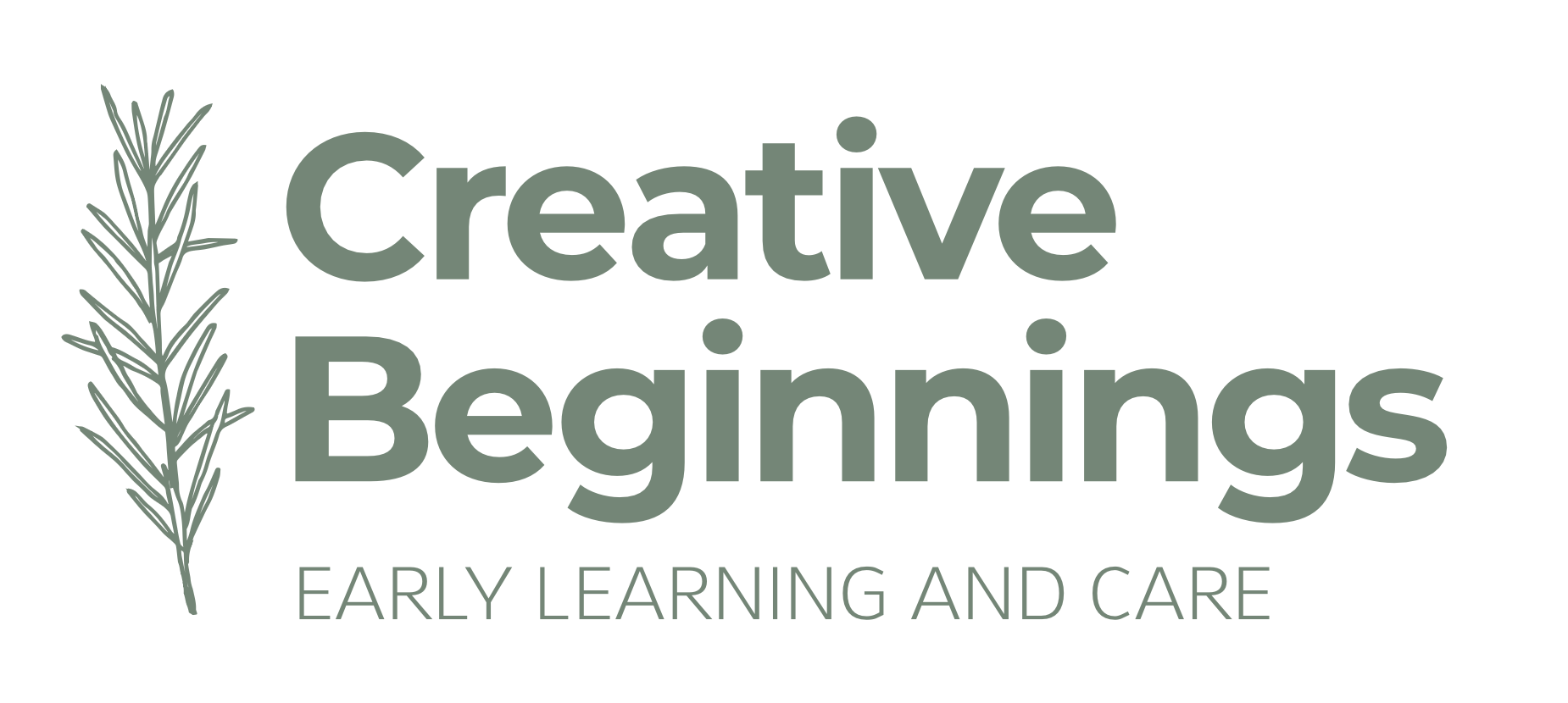
AFTER
THE CHALLENGE
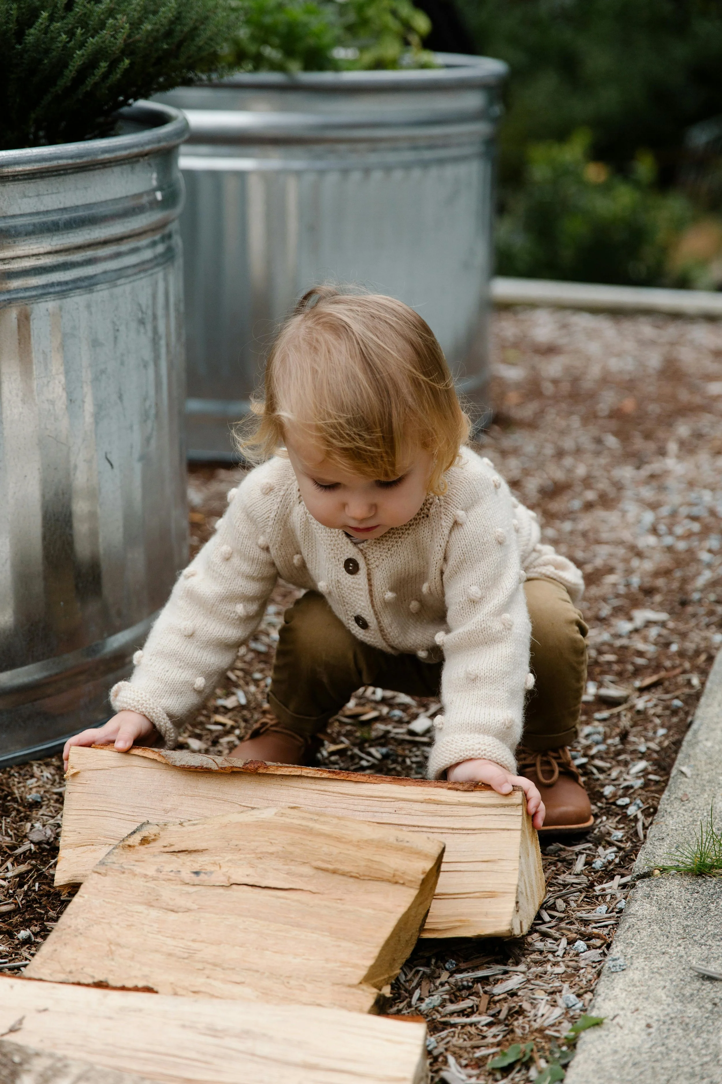
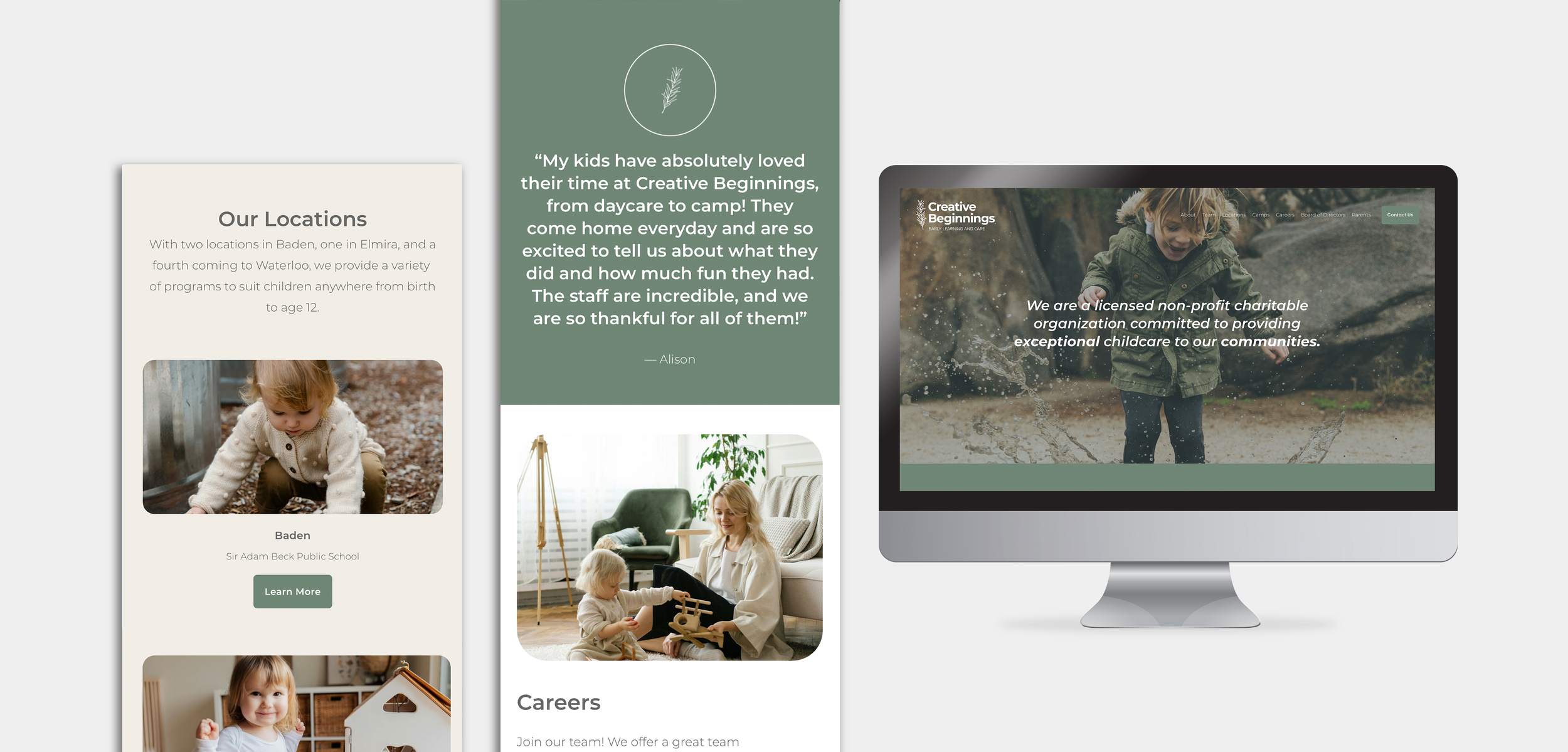
The brand needed to evolve from looking like a generic childcare provider to embodying an environment that inspires curiosity, learning, and growth. They wanted a brand that reflected their Reggio Emilia–inspired approach and emphasized natural play, while staying approachable to families and communities.

We designed a new identity system that brings their values to life:
THE SOLUTION
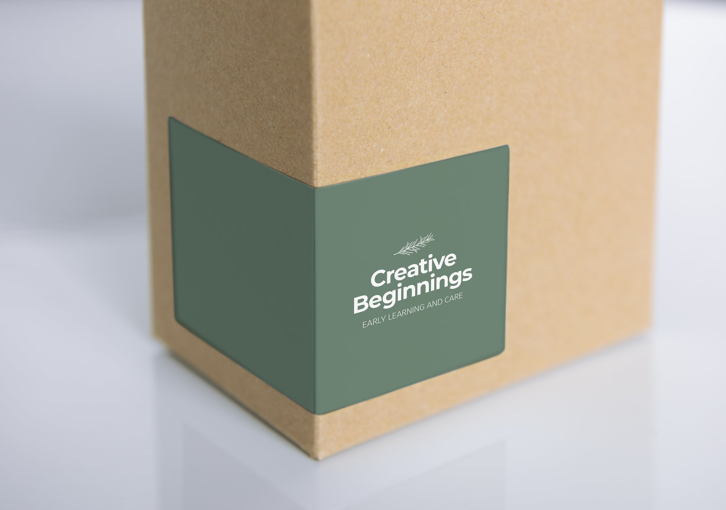
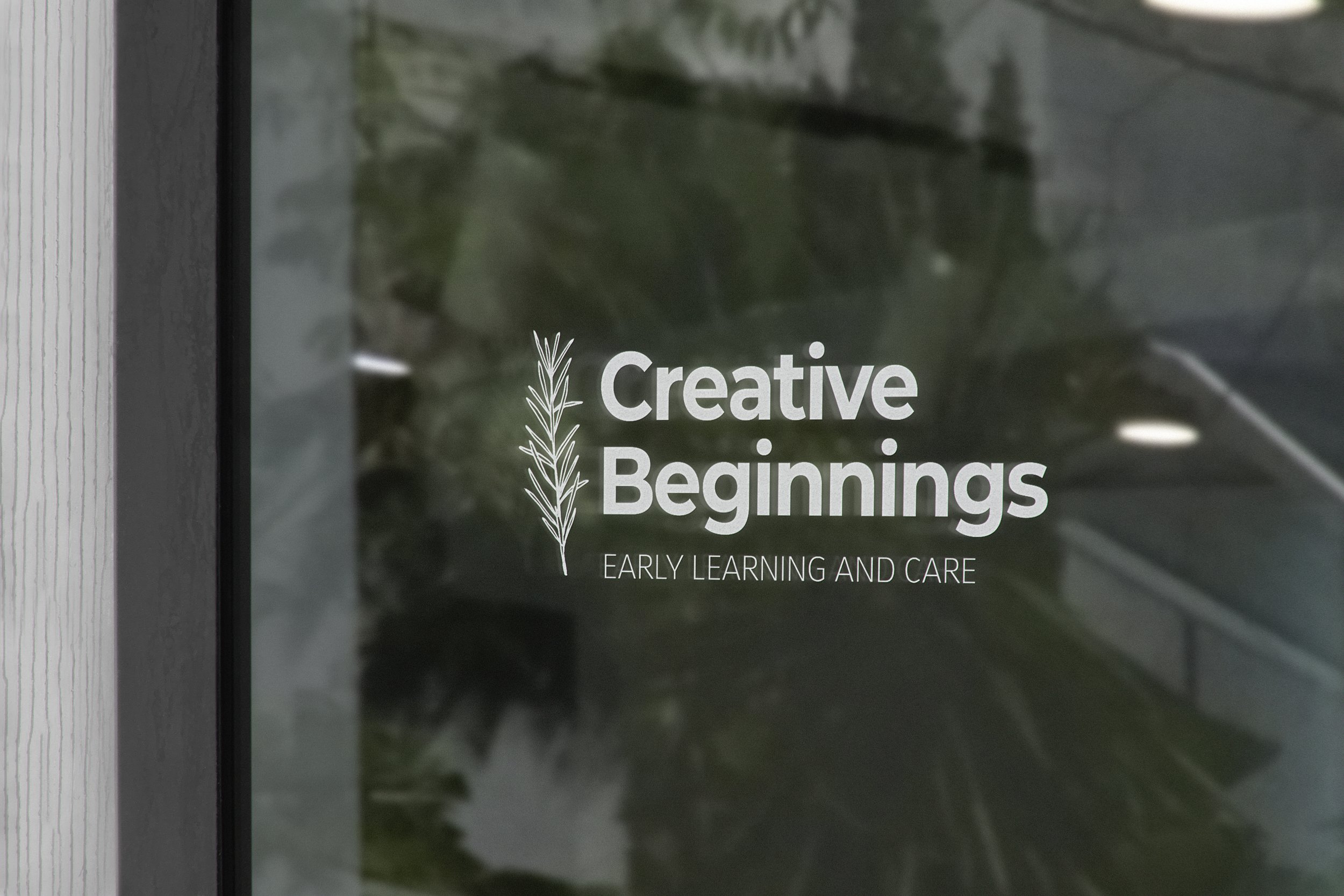
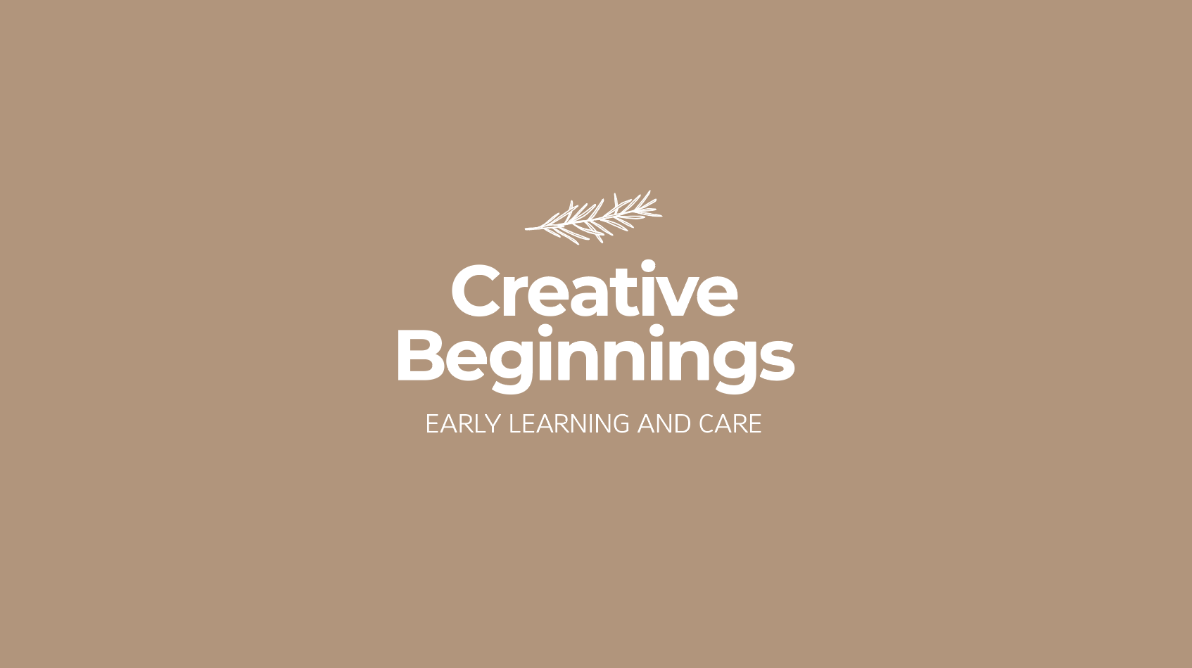
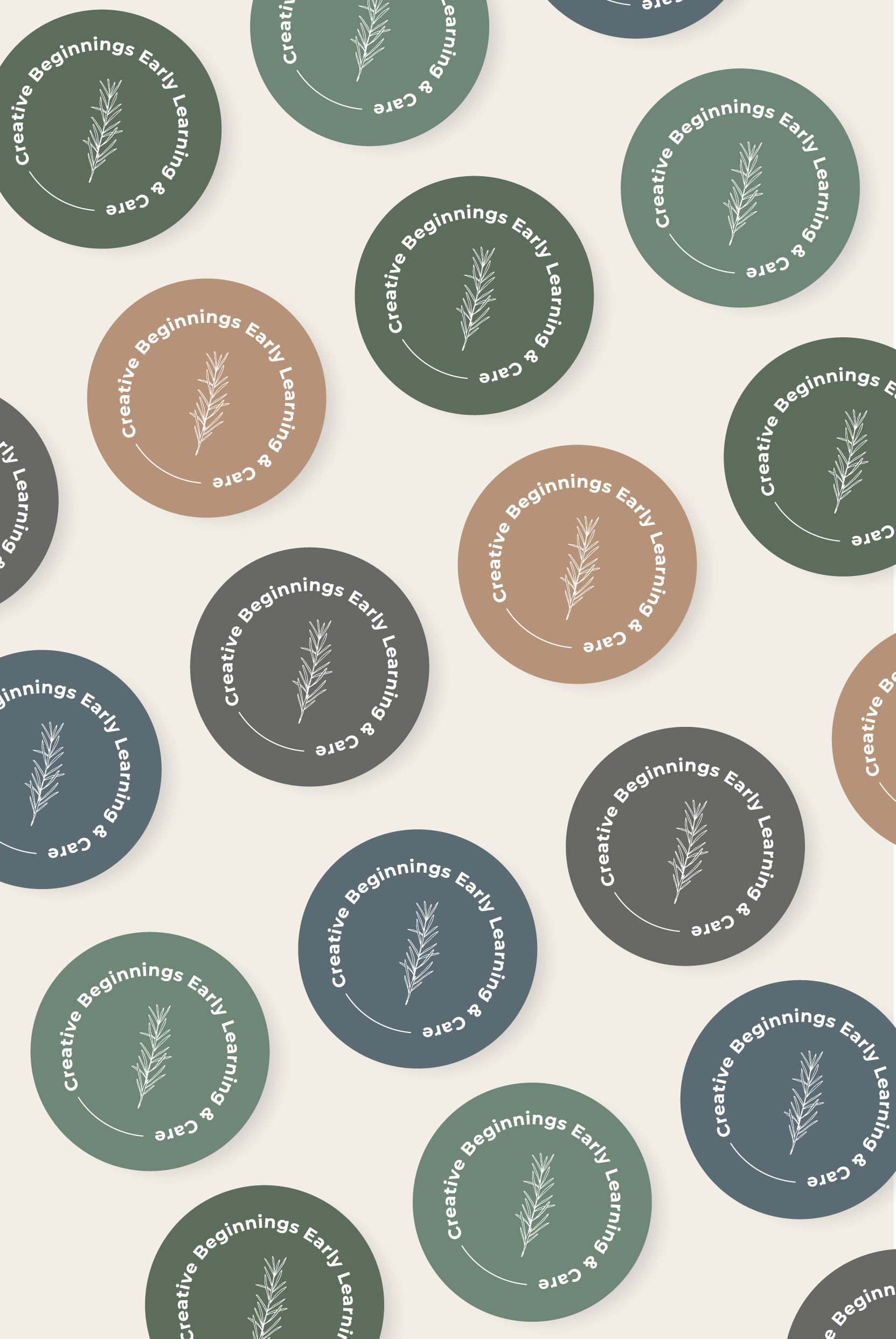
A natural palette of earthy greens, deep blues, and warm wood-inspired tones.
Colour PaletteSimplistic, modern sans-serif fonts that feel welcoming and timeless.
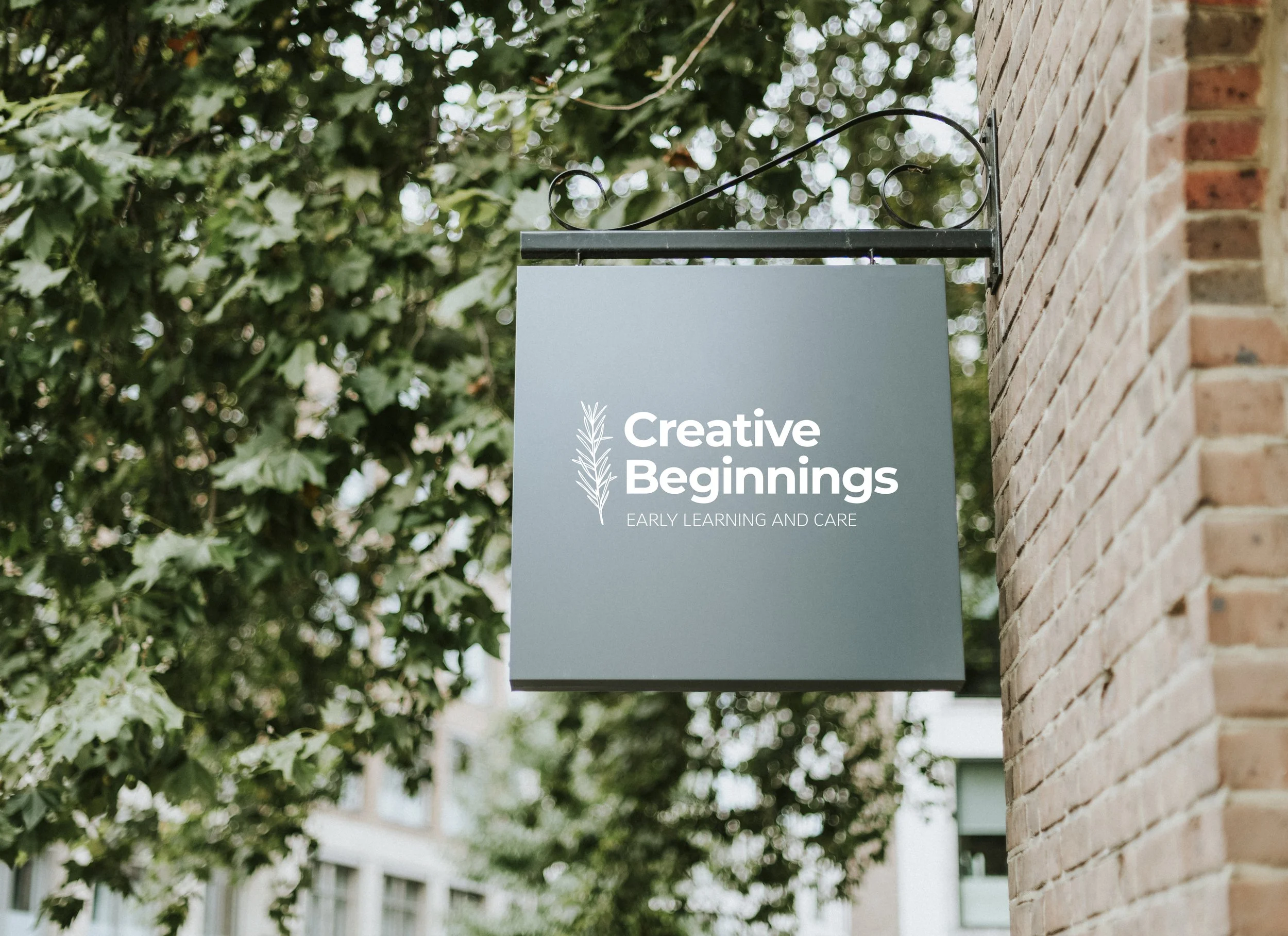
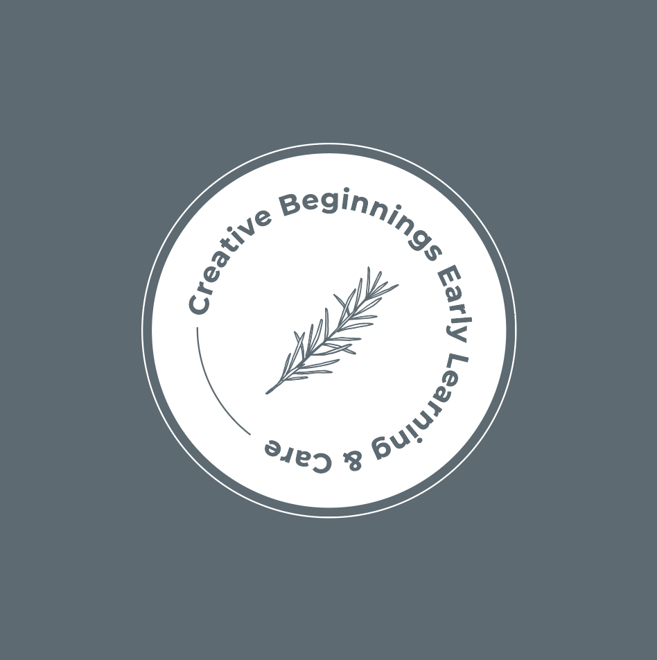
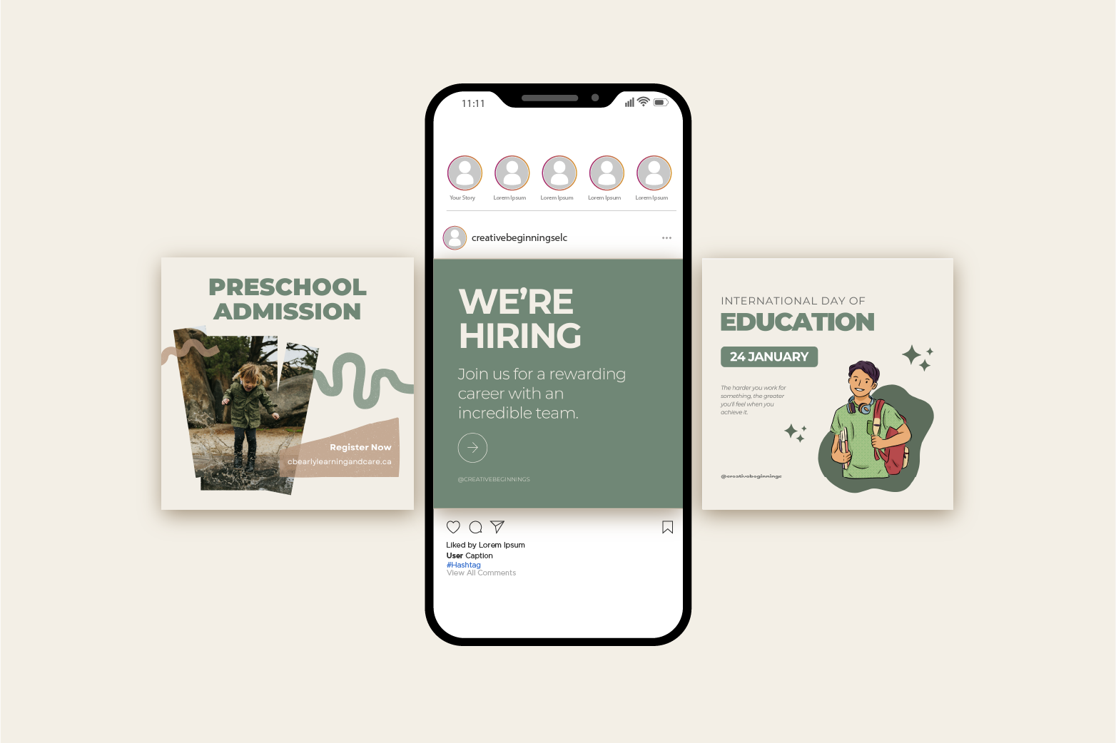
TypographyA flexible suite of primary and secondary logos paired with organic leaf-inspired brand marks, ensuring adaptability across signage, print, and
digital platforms.
Logo SystemVisual ToneLight, airy, and organic - avoiding anything that felt overly “institutional” or plastic.

THE RESULT
The new brand reflects Creative Beginnings’ mission to nurture children through exploration and connection with their environment. It positions them not just as a childcare provider, but as a place of learning, growth, and community.

"I had the pleasure of working with Pine & Pixel, and I can’t recommend them enough! Jessica’s approach is both intuitive and incredibly knowledgeable—she truly understands branding, design, and how to capture the essence of an organization. She takes the time to listen, ask the right questions, and translate ideas into visuals and messaging that feel both authentic and strategic.
Her ability to balance creativity with practicality is unmatched. Whether it’s designing marketing materials, refining brand identity, or ensuring messaging aligns with an organization’s core values, Jessica just gets it. Her work is thoughtful, intentional, and always polished.
If you’re looking for someone who doesn’t just design but truly understands the deeper layers of marketing and storytelling, Jessica at Pine & Pixel is the one to trust!"
— Christa O'Connor, RECE, Chief Executive Officer

Get In Touch
Like what you see? Reach out to learn how we can make your brand come to life.